Autumn Forest Floor – Tutorial #130

 dsc06304b.jpg

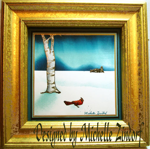
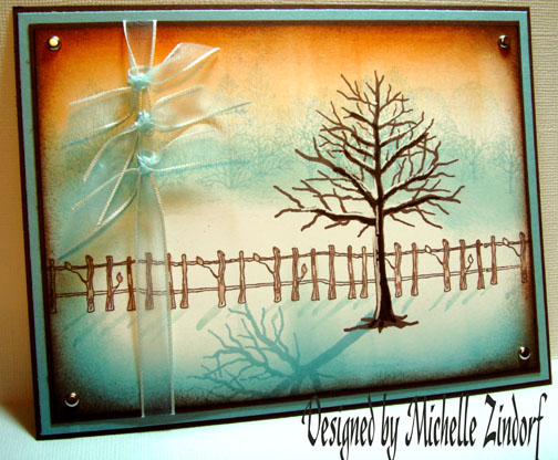
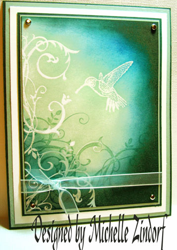
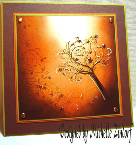
Color Challenge Time!  I love the color challenges on Split Coast Stampers on Tuesdays.  I took a stab at today’s Color Challenge CC187 to use the Stampin’ Up colors Chocolate Chip, Kiwi Kiss and Tangerine Tango.  I found this to be a great color combo for Autumn.  Here is a link to the challenge if you want to play along:  http://www.splitcoaststampers.com/forums/showthread.php?t=388280

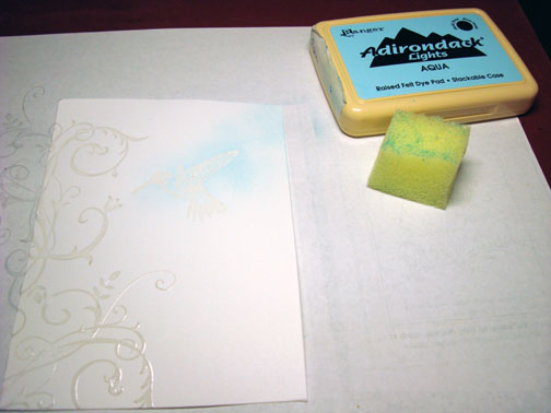
You may have noticed lately that I have been trying to make use of the white of my paper.  Today I used the white of the paper and made it my light source in the scene.

Well this is tutorial #130.  Are you crying Uncle?  Had enough?

If not, let’s get started on the tutorial.  🙂
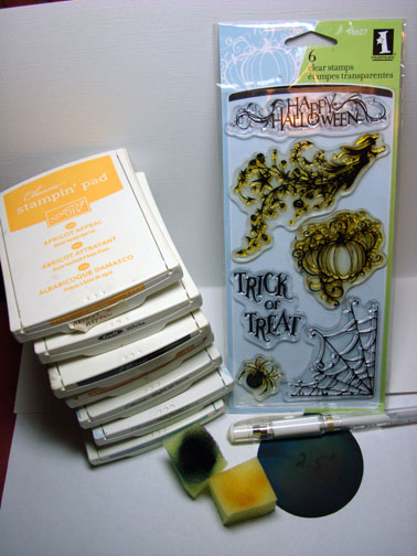
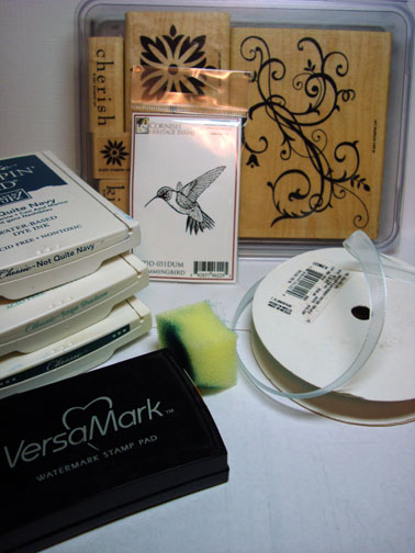
Supplies:

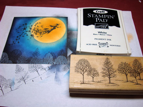
Stamps:Inkadinkado “Fall Season”
Paper: Stampin’ Up Whisper White, Kiwi Kiss, Tangerine Tango & Chocolate Chip
Ink: Stampin’ Up Kiwi Kiss, Chocolate Chip, Tangerine Tango & Basic Black
Accessories:Versamark Pad & Marker, Sponges, White Gel Pen, Fine Detail Clear embossing powder, heat gun, Stampin’ Up Markers Chocolate Chip & Old Olive, Copper Brads

dsc06309.JPG

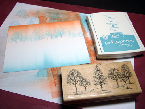
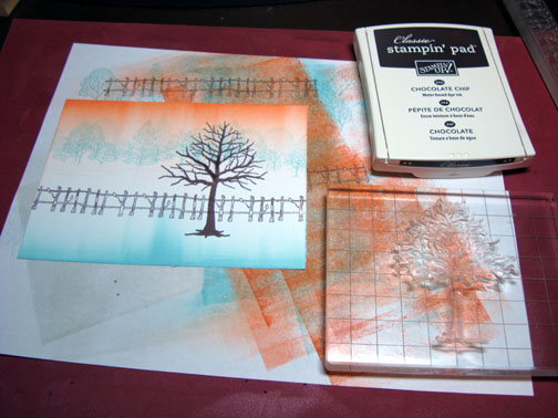
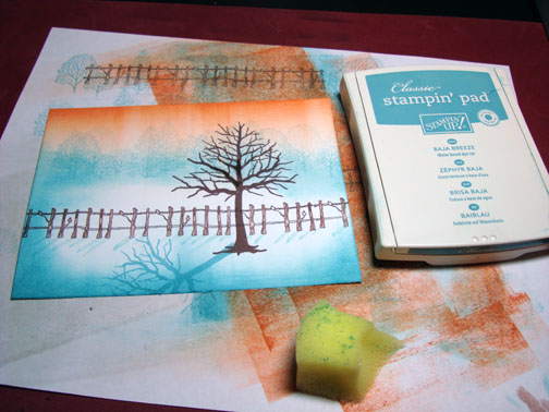
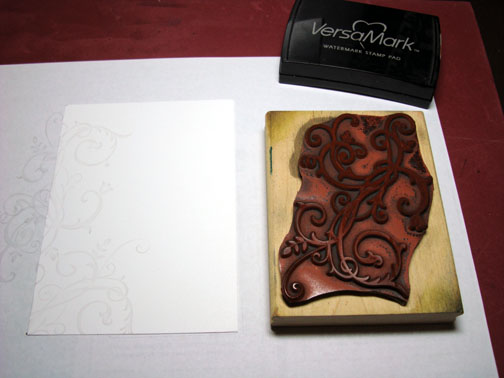
Stamp tree by first loading stamp with Versamark and then loading with Chocolate Chip ink before stamping.  I also did not put the Versamark or the ink on the very bottom of the tree trunk to omit the root part of the stamp.  After stamping I extended the trunk of the tree with a Chocolate Chip marker and colored over the marker with a Versamark marker.

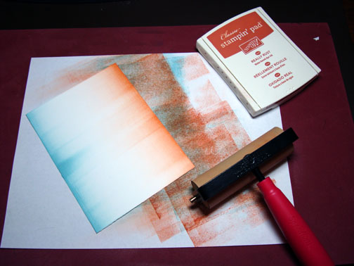
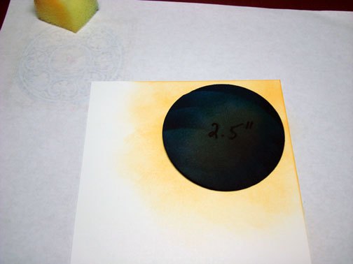
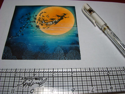
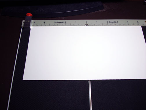
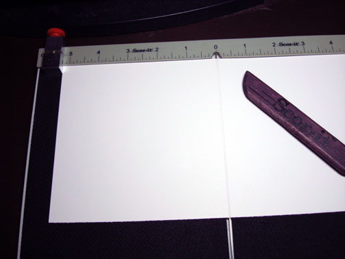
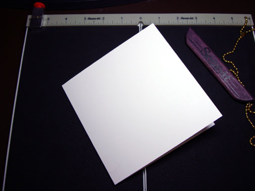
My Whisper White card stock measures 4.5″ square starting out, but I cropped it at the end to measure 4.25″ square due to a nice chocolate chip fingerprint at the top, lol.

dsc06288.JPG

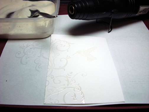
Heat embossed the image using fine detail clear embossing powder and a heat gun.

dsc06289.JPG

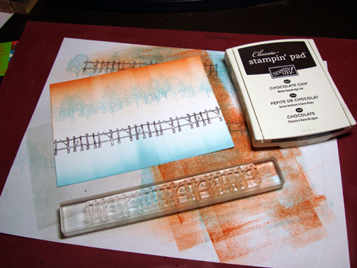
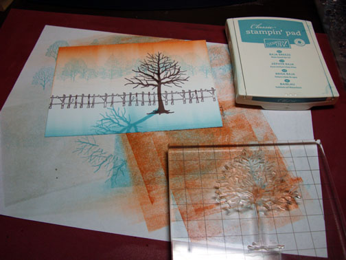
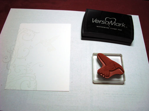
Over stamp the tree a bit to the left by first loading the stamp with Versamark and then loading it with Kiwi Kiss ink before stamping it.  I omitted the root part of the tree again.  Extended the trunk with an Olive Marker and then colored over the marker with a Versamark marker.  Heat embossed the image using clear embossing powder and a heat gun.

dsc06290.JPG

dsc06292.JPG

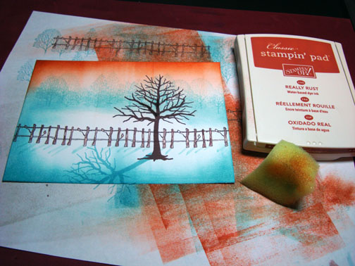
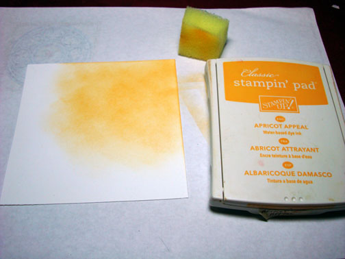
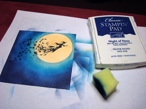
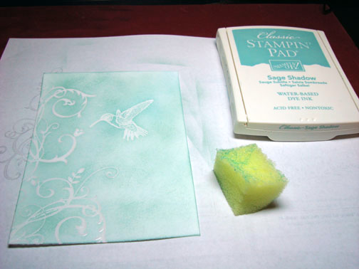
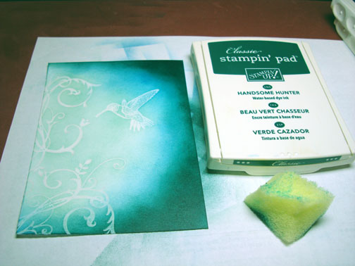
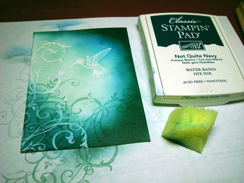
Sponged on Tangerine Tango ink, using a circular motion and be more heavy toward the outside edges. 

Note:  If your sponged ink looks really splotchy add more ink until it smooths out.

dsc06294.JPG

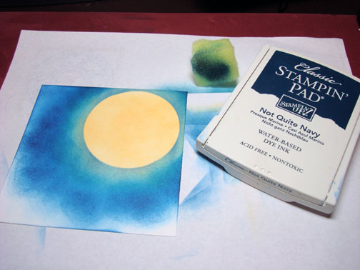
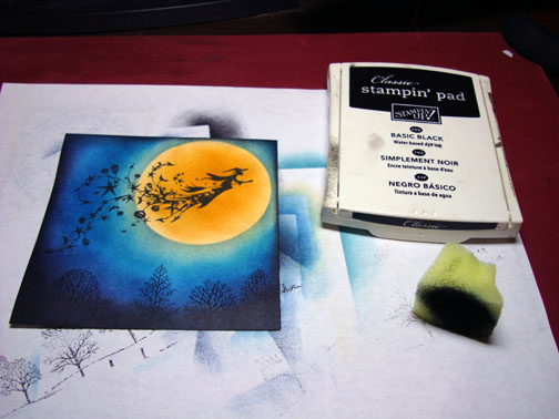
Sponged on Chocolate Chip ink.

dsc06295.JPG

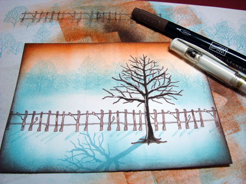
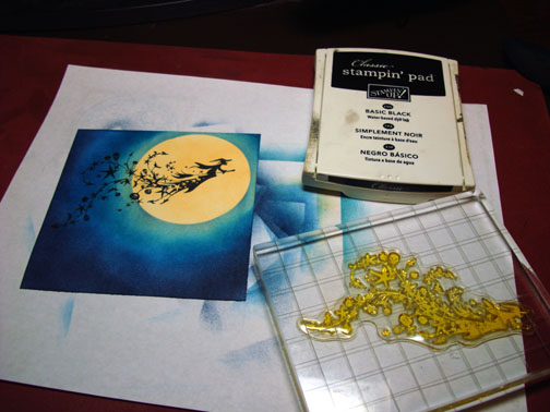
Stamped the top of the tree with Chocolate Chip ink at the bottom of and left side of the card stock.

dsc06296.JPG

Sponged on Basic Black ink at the bottom two corners.

dsc06297.JPG

Stamp the top of the tree image with Kiwi Kiss at the bottom of the card stock.

dsc06298.JPG

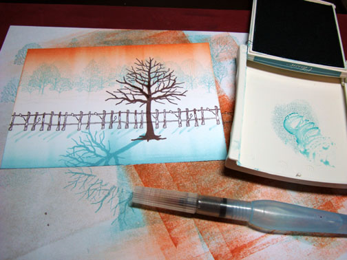
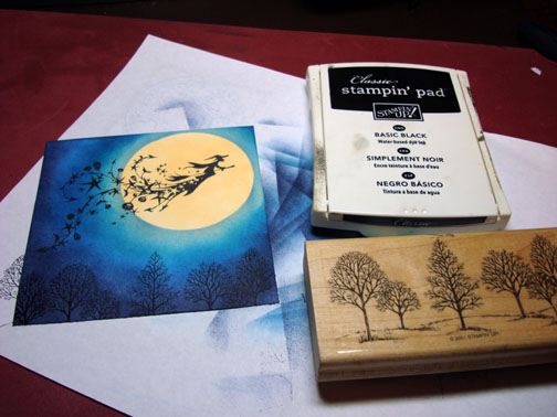
Added a few white gel pen highlights to the tree and the plants at the bottom of the card stock.

dsc06300.JPG

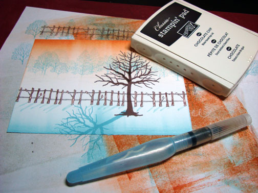
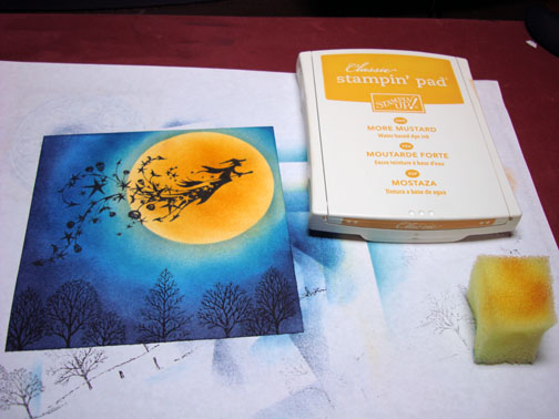
Here is the card front finished measuring 5.5″ square.

dsc06304b.jpgHope this tutorial has inspired you to use this color combination.  I love it.

May your day be filled with light!

Until my next post.. . . . . . . . . .

Hugs,

Michelle

Links to all my tutorials can be found here:  http://zindorf.blogs.splitcoaststampers.com/tutorials-ive-written/

Here is a link to my workshop calendar if you want to get info on beginner and advanced Brayer workshops:  http://zindorf.blogs.splitcoaststampers.com/workshop-calendar


Cup of Joe & Flower – Tutorial

dsc06283.JPG

Coffee is on my mind this morning.  🙂  Our power, for some strange reason, has been going off and on this morning so getting my coffee brewed was a challenge in itself. 

This is a little still life scene tutorial.  I was able to achieve this look by using the emboss resist technique.  You can stack any images by heat embossing the images.  You will want to start with the image that will be in foreground, then the middle ground and then put in your background.  In other words, work front to back in your scene.

Let’s get started on the tutorial.

Supplies:

Stamps: Stampin’ Up What’s Brewin’ & Touch of Nature
Paper: Stampin’ Up Whisper White, Cool Caribbean & Summer Sun
Ink: Stampin’ Up Tempting Turquoise & Basic Black, Adirondack Aqua
Accessories: Versamark pad & Marker, Fine Detail Embossing Powder, Heat Gun, Tim Holtz Ruler, Push Pin, Stampin’ Up markers, Prismacolor Markers, Sponge, White Gel pen, Post it note

dsc06287.JPG

Stamped flower by first loading the stamp with Versamark and then Black ink before stamping.  Note:  I did not put Versamark or ink on the stem part of the image because I wanted to omit that part.

dsc06263.JPG

Heat embossed the image using fine detail embossing powder and a heat gun.

dsc06264.JPG

Colored the flower with a Prismacolor Spanish Orange marker.

dsc06265.JPG

Added some Yellow orange to the inner part of the petals.

dsc06266.JPG

Added some Pumpkin Orange to the very inner part of the petals.

dsc06267.JPG

Colored the center in with Sienna Brown.

dsc06268.JPG

Added Dark Umber marker to the center of the flower, but left the very center light.

dsc06269.JPG

Colored over the flower with Versamark marker and heat embossed the image using clear embossing powder and a heat gun.

dsc06270.JPG

dsc06271.JPG

Stamped the cup over part of the flower with Tempting Turquoise ink.

dsc06272.JPG

Colored over the entire cup image with a Tempting Turquoise marker to omit the heart design in the cup.

dsc06273.JPG

Colored the coffee in with a Chocolate Chip marker.

dsc06274.JPG

Added Taken with Teal marker to the left side of the cup to create a shadow.

dsc06275.JPG

Colored over the entire cup image with  a Versamark marker.  Note:  be careful to start by coloring your light part of the image first and then color over the dark part of the image.  The dark part of the image will transfer to your lighter colors if you color from the dark part of the image to the lighter ones.

dsc06276.JPG

Heat embossed image using clear embossing powder and a heat gun.

dsc06277.JPG

Used a post it note to mask the bottom portion of the card stock.

dsc06278.JPG

Sponged Aqua ink in the uncover part to create the wall in the background.

dsc06279.JPG

Added some shadow on the wall by sponge Tempting Turquoise ink lightly on the left and top part of the card stock.

dsc06280.JPG

Removed the post it note and added some Aqua ink with a sponge to the left of the coffee cup to create a shadow.

dsc06281.JPG

Assembled card fronted and added faux stitching by piercing holes down the left and right sides of the card stock with a push pin and a Tim Holtz Ruler (ruler has piercing holes that run the length of the ruler).   Drew a line from one hole to the next with a white gel pen to create the faux stitching.

dsc06282.JPG

Here is the card completed measuring 5.5″ square.

dsc06283.JPG

May your day start off with your most favorite beverage too.

Until my next post. . . . . . . . . . . .

Hugs,

Michelle

Links to all my tutorials can be found here:  http://zindorf.blogs.splitcoaststampers.com/tutorials-ive-written/

Here is a link to my workshop calendar if you want to get info on beginner and advanced Brayer workshops:  http://zindorf.blogs.splitcoaststampers.com/workshop-calendar


This Weeks Framed Moody Tree Tutorial, Blog Candy and Workshop Announcement

dsc06256.JPG

Beginner Brayer Workshop Announcements:  After many requests, I have added a Dayton, Ohio beginner Brayer workshop to my calendar for November 8th at Marco Paper.   Workshops are kept small so I can spend time with each person attending.  No prior brayer experience required.  The brayer will no longer be a mystery tool after attending.  To register, please contact Marco Paper at 937-433-7030 or 1-888-733-5239 or website at http://marcopaper.com/index.html .  I also have a Beginner Brayer Workshop scheduled for October 25th Sunnyvale, CA Please call Cranberry Hill to sign up for this workshop (408) 736-9151 or  http://www.stamponover.com/ .

Now about today’s project, I’m giving this framed piece away as blog candy.  All you need to do is leave a comment on this post for me to enter you for the drawing.  If you are getting this blog update by e-mail you will need to click on this link to leave a comment on the post:  http://zindorf.blogs.splitcoaststampers.com/2008/10/05/this-weeks-framed-moody-tree-tutorial-blog-candy-and-workshop-announcement/

I will use a random number generator on Saturday, October 11th to select the winner.  Good luck to everyone. 🙂

Very little supplies were used to create this piece.  I even used a very common household item to create some texture in the sky (plastic wrap), check it out.  🙂

Supplies:

Stamps: Stampendous “Winter Trees”
Paper: Stampin’ Up Whisper White & Basic Black
Ink: Adirondack Lake Mist, Sail Boat Blue, Aqua & Pitch Black
Accessories: Brayer, Plastic Wrap, Sponges & Re-purposed Garage Sale

dsc06262.JPG

Punched a 1 3/8 circle from the sticky part of a post it note to use as a mask for the moon.  Placed it where I wanted my moon to be on a 3 1/2″ x 5 1/2″ piece of Whisper White card stock.

dsc06244.JPG

Brayered Sail Boat Blue ink at the bottom of the card stock.

dsc06245.JPG

Brayered Aqua ink at the top of the card stock.

dsc06246.JPG

Crumpled up a piece of plastic wrap.

dsc06247.JPG

Removed the moon mask and inked up my plastic wrap with Lake Mist ink and dabbed it on the top of the card stock.

dsc06248.JPG

Dabbed on some Sail Boat Blue with the same crumpled up plastic wrap.

dsc06249.JPG

Stamped the tree with Pitch Black ink.

dsc06250.JPG

Sponged Pitch Black ink heavily on the bottom of the card stock.

dsc06251.JPG

Sponged Sail Boat Blue across the top of the card stock.  Also added some through the middle of the card stock.

dsc06252.JPG

Adhered my main image panel to a white card stock panel and then a Black card stock panel. 

dsc06254.JPGPut it in a re-purposed Garage Sale Frame ($2).  I don’t normally pay more than a dollar for a frame at a garage sale, but this one is solid wood and quite heavy.

Finished piece with  the Black panel measuring 5″ x 7″.

dsc06256.JPG

Enjoy your Sunday!

Until my next post. . . . . . . . . .

Hugs,

Michelle

Links to all my tutorials can be found here:  http://zindorf.blogs.splitcoaststampers.com/tutorials-ive-written/

Here is a link to my workshop calendar if you want to get info on beginner and advanced Brayer workshops:  http://zindorf.blogs.splitcoaststampers.com/workshop-calendar


The Blog Candy Winner is. . . . . . .

dsc06162.JPG

AND THE WINNER OF THIS FRAMED WINTER PIECE OUT OF 184 ENTRIES IS . . . . .. .. . . . .  . . . . . . . .

Linda Watts who wrote, “Hi Michelle, Cardinals are one of my favorites. I love this framed art. My husband and I just scored a ton (well almost a ton – a lot anyway) of fabric and wall paper samples from a closed factory here in our little town. We are both looking forward to all the interesting things we can make with someone else’s trash!”

Linda Watts, please e-mail your address to me at mzindorf@aim.com and I’ll put it in the mail to you.

Thanks to all who played along!  Wow, you all have some great ideas of re-purposing things.  If you want to read all of the great ideas for re-purposing that everyone left,  here is a link back to the post for you to read the comment section:    http://zindorf.blogs.splitcoaststampers.com/2008/09/27/winter-cardinal-tutorial-124-and-blog-candy/

Hugs,

Michelle


Mister Cardinal – Tutorial #127

dsc06240.JPG

BEWARE, enablers are every where!!!!!

I found an enabler in Austin, TX at one of my workshops, her name is Joy McHargue.  Joy showed me this set “Season of Splendor” from Close To My Heart.   She wanted to know what I would do with this set.  Well I took one look at the beautiful stamps and the great envelope packaging with the cute snap closure and I instantly wanted to see more of this line.

Joy the Enable gave me a catolog.  I can’t believe I haven’t seen this line of stamps before.  Anyway, I had a nice crisp Close to My Heart Catolog and a long plane ride from Austin, TX to Ohio.  The very next day I was placing my order, lol.  I’m so very, very weak!

Long story short, Joy, here is an example of what I would do with this set, lol. 

If you wish to be enabled too, here is Joy’s website at Close to My Heart:  http://joysfunprojects.myctmh.com/WebSites/Templates/MyCTMH/Template1.aspx?Reload=Yes you can shop 24/7. 

dsc06213.JPG

Let’s get started on the tutorial.  🙂

Supplies:

Stamps: Close to my Heart “Season of Splendor”
Paper: Stampin’ Up Whisper White, Bordering Blue, Not Quite Navy
Ink: Stampin’ Up Bordering Blue, Not Quite Navy, Old Olive
Accessories: Prismacolor Markers, Brayer, Versamark Marker, Fine Detail Clear embossing Powder, Heat Gun, Silver Brads, Photo Corner Punch, White Gel Pen, Sponges

dsc06242.JPG

Stamped Holly leaves with Palette Noir Black ink on a 4″ x 5.5″ piece of Whisper White card stock.

dsc06214.JPG

Stamped the Holly Leaf stem stamp with Noir Black to extend the branch.

dsc06215.JPG

Stamped the image one more time to continue to extend the branch.

dsc06216.JPG

Colored the top half of the leaves with a Prismacolor Light Olive Green marker.

dsc06217.JPG

Colored the bottom half of the leaves with a Dark Olive Green Marker.

dsc06218.JPG

Went over the Leaves and branch with a Versamark marker.

dsc06219.JPG

Heat embossed the images with fine detail clear embossing powder and a heat gun.

dsc06220.JPG

Stamped the Cardinal with Palette Noir Black ink.

dsc06221.JPG

Colored the Cardinal in with a Crimson Red marker.

dsc06222.JPG

Added Mahogany Red to the bottom of the bird, wing and head.

dsc06223.JPG

Went over the bird again with the Crimson Red marker to blend the colors together.

dsc06224.JPG

Colored in the beak with a Burnt Ochre marker.

dsc06225.JPG

Colored over the entire Cardinal with a Versamark marker.

dsc06226.JPG

Heat embossed the Cardinal with clear embossing powder and a heat gun.

dsc06227.JPG

Note:  I use a small paint brush to brush away any stray embossing powder before heating the image. 

dsc06243.JPG

Brayered Bordering Blue ink at the top of the card stock.

dsc06228.JPG

Note:  I test images and colors on my scrap paper before I stamp them on my project.  This helps to keep me from groaning in agony so early in the morning.  🙂

dsc06229.JPG

Stamped Olive leaves with Old Olive ink.

dsc06230.JPG

Stamped the leaves solid image with Bordering Blue to fill the leaves in.

dsc06231.JPG

Stamped some berries with Palette Noir Black ink and colored them in with a Prismacolor Crimson Red marker.

dsc06232.JPG

Sponged Bordering blue on the left side top half of the card stock.

dsc06233.JPG

Added some Not Quite Navy ink at the top left side of the card stock.

dsc06234.JPG

Oops!  I had an ink smug at the lower left side of the card stock.  Time to sponge some Bordering Blue to cover that up.  Yep, I do that all the time.  🙂

dsc06235.JPG

Added some highlights to the tops of some of the embossed leaves and stems with a White Gel pen.

dsc06237.JPG

Assembled the card front and here you have it finished measuring 5″ x 6.5″.

Note: those are Photo corner punches in the corners under the main image.  🙂

dsc06240.JPG

May your day be filled with the sweet sounds of birds singing and please watch out for those enablers!  They can be deadly to your check book. 

Until my next post. . . . . . . . . . .

Hugs,

Michelle

Links to all my tutorials can be found here:  http://zindorf.blogs.splitcoaststampers.com/tutorials-ive-written/

Here is a link to my workshop calendar if you want to get info on beginner and advanced Brayer workshops:  http://zindorf.blogs.splitcoaststampers.com/workshop-calendar


Frosty Tree – Tutorial #126

dsc06211.JPG

When I woke up this morning I decided to check out the Color Challenge on Split Coast Stampers  http://www.splitcoaststampers.com/forums/showthread.php?t=386411

The color challenge today was to use Stampin’ Up colors Baja Breeze, Really Rust and Chocolate Chip.  This combo really intrigued me so I gave it a whirl.  This is what I came up with.  The Baja Breeze really gives an icy feel to this piece.  I know, I know, I know it is Autumn, not Winter yet, but this is what came to mind.

Let’s get started.  🙂

Supplies:

Stamps: Impression Obsession “Branches of a Tree”, The Saltbox Studio “Fences” & Stampin’ Up “Lovely as a Tree”
Paper: Stampin’ Up Whisper White, Baja Breeze & Chocolate Chip
Ink: Stampin’ Up Baja Breeze, Really Rust & Chocolate Chip
Accessories: Chocolate Chip marker, White Gel Pen, Aqua Painter, Sponge, Ribbon, Silver Brads, Brayer

dsc06212.JPG

Brayered Baja Breeze ink at the very bottom of a 4.5″ x 6″ piece of Whisper White card stock.

dsc06197.JPG

Brayered Really Rust at the very top of the card stock.

dsc06198.JPG

I decided to not use any emboss resist this morning, so this scene is being built from the background to the foreground, so I had to keep in mind to go from lighter objects to darker ones.  So the darker (foreground) objects cover up the lighter ones underneath them.  Clear as mud?

Stamped trees from Lovely as a Tree set with Baja Breeze ink, by stamping off on my scrap paper first to make them lighter (this is called second generation stamping).

dsc06199.JPG

Stamped fence with Chocolate Chip ink.

dsc06200.JPG

Stamped large tree with Chocolate Chip ink.

dsc06201.JPG

Stamped tree again to make a shadow using Baja Breeze ink. 

Note, I did not ink up the root part of the tree trunk in order to omit it.

dsc06202.JPG

While my Baja Breeze stamp pad was closed, I squeezed it to make a pool of ink in the lid of the stamp pad.   I used the pool of ink and an Aqua painter to make shadows for the fence posts.  I made the ink pretty watery here.

dsc06203.JPG

Used the Aqua Painter again with a watery Chocolate Chip ink to color in the fence posts.

dsc06204.JPG

Sponged Baja Breeze along the bottom of the background trees and around the sides and bottom of the card stock.

Note:  I use a dry sponge when sponging.  If you are getting dots and streaks you don’t want, keep adding more ink until they disappear.  Another problem could be you are using a card stock that is not super smooth.

dsc06205.JPG

Sponged Really rust at the very top of the card stock.

dsc06206.JPG

Darkened some of the large tree branches with a Chocolate Chip marker.  Added some snow on the branches with a White Gel Pen.

dsc06207.JPG

Added Panels, Front to back, Main image panel, Chocolate Chip Panel, Baja Breeze Panel, Chocolate Chip panel.

Assembled card front and here it is finished measuring 5″ x 6.5″.

dsc06211.JPG

I hope you enjoyed this icy scene tutorial and will give this color combo a try.

May your day be filled with laughter and joy.

Until my next post. . . . . . . . .. . .

Hugs,

Michelle

Links to all my tutorials can be found here:  http://zindorf.blogs.splitcoaststampers.com/tutorials-ive-written/

Here is a link to my workshop calendar if you want to get info on beginner and advanced Brayer workshops:  http://zindorf.blogs.splitcoaststampers.com/workshop-calendar


A Witchie Night – Tutorial #125

dsc06193.JPG

This morning I brought back out this witch from the set “All Hallow’s Eve” by Inkadinkado.  This has to be one of the funniest images for the Autumn season this year.  The trees at the bottom of this card are from the Stampin’ Up set “Lovely As a Tree”. 

Let’s get started on today’s tutorial.  🙂

Supplies:

Stamps: Inkadinkado “All Hallow’s Eve” & Stampin’ Up “Lovely As a Tree”
Paper: Stampin’ Up Whisper White, Apricot Appeal, Not Quite Navy & Basic Black
Ink: Stampin’ Up Apricot Apeal, Craft White, Basic Black, More Mustard, Night of Navy, Not Quite Navy, Baja Breeze
Accessories: Circle template & Coluzzle, White Gel Pen, Sponges

dsc06196.JPG

Sponged Apricot Appeal ink on the upper right hand corner of a 4.5″ square piece of Whisper White card stock.

dsc06181.JPG

Cut a 2.5″ circle of card stock with my Coluzzle to use as a mask for the moon.

dsc06182.JPG

Held the circle mask in place as I sponged Baja Breeze ink around the out side of the mask.

dsc06183.JPG

Removed the masked and sponged Not Quite Navy on the card stock, not covering the Baja Breeze ink entirely.

dsc06184.JPG

Ignore the witch being stamped, lol.  Missed taking a photo.  🙂

Sponged Night of Navy ink on the card stock, not covering the Not Quite Navy ink entirely.

dsc06185.JPG

Then I stamped the Witch with Basic Black ink.

dsc06186.JPG

Stamped Trees with Basic Black ink at the bottom of the card stock.

dsc06187.JPG

Sponged More Mustard ink on the moon leaving the outer edge light.

dsc06188.JPG

Sponged Basic Black ink around the edges of the card stock.

dsc06189.JPG

Stamped more trees at the bottom of the card stock.  Used White Craft ink this time.

dsc06190.JPG

Using the edge of the stamp pad, smeared some stripes of White Craft ink across the card stock.

dsc06191.JPG

Using a ruler and a white gel pen, made some dashy lines across the card stock.  Also, colored in the stars and added a few dots here and there.

dsc06192.JPG

Here is the finished card front measuring 5.5″ square.

dsc06193.JPG

Thought I would show you my new tool.  I’m so excited!  No more crooked card bases for me.  🙂  I got a Scor-it Board so I can make the scores on my card bases.  I never show it in my tutorials but I attach all of my card fronts to a White card stock base card.  I’ve tried to get an even fold by folding my card base in half, but it never is really straight.  Now that I have this Scor-it Board, I won’t have that problem any longer, YEAH!!!

Let me show you how simple I found this tool to be.

This is what the board looks like.  It looks heavy, but is very light.

dsc06123.JPG

I cut my card stock for my base card.  Move the little brace at the top to the measurment I want. 

dsc06125.JPG

Insert the scor-it tool at the “zero” notch and pull in streight down the middle rail.

dsc06126.JPG

Nice straight score line.  This makes me so happy.

dsc06127.JPG

Fold the card at the score line and there you have a straight card base.  There are all kinds of folded cards, bags, etc. you can make with a scoring tool.  I’ll have to check those out.

I got my Scor-it board from Marco’s Paper.  Here is a link:  http://www.marcopaper.com/

dsc06128.JPG

Hope your day is filled with crisp Autumn breezes and sunshine.

Until my next post. . . . . . . . . .

Hugs,

Michelle

Links to all my tutorials can be found here:  http://zindorf.blogs.splitcoaststampers.com/tutorials-ive-written/

Here is a link to my workshop calendar if you want to get info on beginner and advanced Brayer workshops:  http://zindorf.blogs.splitcoaststampers.com/workshop-calendar


Winter Cardinal – Tutorial #124 and Blog Candy!

dsc06162.JPG

Happy Saturday!  I love the weekends when I can take my time doing a project in the morning as I drink my pot of coffee.  No rushing off to work today.

I’ve had some requests to do some winter type scenes so I got out this great set of stamps by Fire Cracker Designs by Pamela.  Here is a link if you want to check out their great online store:  http://www.safesecurestore.com/stores/merchant.mvc?Screen=SFNT&Store_Code=firecrackerdesignsbypamela

For those people already making their Christmas cards, MORE POWER TO YOU!  I won’t be starting mine until November at the earliest, lol.

The frame I used in this project is one I picked up at a garage sale for 75 cents.  It had a horrible picture in it, but that’s all the better.  I didn’t feel bad throwing the picture in the trash.  I get frames and then make stamped pieces to go inside.  It’s easier to know what frame you are going to use and then cut your cardstock to fit it, instead of making the piece a certain size and trying to find a frame to fit the piece.  Clear as mud?  🙂

I’m giving this framed piece away as blog candy.  I will use a random number generator next Saturday, October 4th to select the winner.  To enter all you need to do is leave a comment on this post telling me an item you like to re-purpose.  It could be anything.  If you are getting this post update by e-mail, you will need to click this link and then leave a comment on the post:  http://zindorf.blogs.splitcoaststampers.com/2008/09/27/winter-cardinal-tutorial-124-and-blog-candy/

Good Luck!

Let’s get started on today’s tutorial.  🙂

Supplies:

Stamps: Fire Cracker Designs by Pamela
Paper: Stampin’ Up Whisper White, Basic Black, Baja Breeze & Not Quite Navy
Ink: Stampin’ Up Not Quite Navy, Baja Breeze, Basic Black, Night of Navy
Accessories: Versmark Pad and marker, Fine Detail Clear Embossing Powder, Heat Gun, Brayer, Sponges, Sharpie Gold Paint Marker, Prismacolor Markers, Fine Black marker, Garage Sale Frame, Post it Notes

dsc06172.JPG

Stamped tree by first loading stamp with Versamark and then loading it with Black ink before stamping it on a piece of 4″ square Whisper White card stock.

dsc06136.JPG

Heat embossed tree using fine detail clear embossing powder and a heat gun.

dsc06137.JPG

Stamped Cardinal by first loading the stamp with Versamark and then loading it with Black ink before stamping it.

dsc06138.JPG

Heat embossed the cardinal using fine detail clear embossing powder and a heat gun.

dsc06139.JPG

Stamped the house in the distance by first loading the stamp with Versamark and then loading it with black ink before stamping it.

dsc06140.JPG

Heat embossed the house using fine detail clear embossing powder and a heat gun.

dsc06141.JPG

Colored the Left half of the tree with a Prismacolor 10% Cool Grey marker.

dsc06142.JPG

Colored Left side of the tree using a Prismacolor 30% Cool Grey marker, but did not cover the 10% Cool Grey entirely.

dsc06143.JPG

Colored the top part of the cardinal using a Prismacolor Scarlet Lake marker.

dsc06144.JPG

Colored the cardinal’s underside and tail using a Prismacolor Crimson Red marker.

dsc06145.JPG

Colored the Cardinal’s beak using a Prismacolor Burnt Ochre marker.

dsc06146.JPG

Colored the very left side of the tree using a Prismacolor 50% Cool Grey marker, not covering the 30% Cool Grey entirely.

dsc06147.JPG

Colored over all the images with a Versmark marker, making sure not to go outside the lines.   🙂

dsc06149.JPG

Heat embossed all the images using fine detail clear embossing powder and a heat gun.

dsc06150.JPG

Covered the bottom of the card stock with a post it note to mask it.

dsc06151.JPG

Brayered on Baja Breeze ink at the top of the card stock.  The embossed images will resist the brayered ink “emboss resist”.

dsc06152.JPG

Brayered on Not Quite Navy at the top of the card stock, not covering the Baja Breeze ink entirely.

dsc06153.JPG

Sponged on some mountain shapes using Not Quite Navy ink.

Note:  If putting in two mountains make one mountain much smaller than the other one so it doesn’t look like your mountains need a bra, lol. 

dsc06154.JPG

Sponged on some Night of Navy ink at the top of the card stock and at the mountain bases.

dsc06155.JPG

Remove the post it note and throw it away.  Using a new post it note, rip through the sticky part of the post it note to create a hill shape.  Put in on the card stock to mask the bottom of the card stock.

dsc06156.JPG

Sponged lightly Baja Breeze ink at the post it notes torn edge.

dsc06157.JPG

Remove post it note.

dsc06158.JPG

Sponge Baja Breeze ink under the tree  and the cardinal to create a shadow for them.

dsc06159.JPG

Add a few specks of black marker around the bird.  Gotta feed the bird!

dsc06160.JPG

Held a Sharpie Gold Paint marker tip, half on the card stock and half on my scrap paper and ran down each edge of the main image panel.  

Note:  Try this out before doing it on your finished panel.  🙂

dsc06161.JPG

Panels are as follows from top to bottom:  Main image panel, Baja Breeze Panel, Basic Black panel, Not Quite Navy Panel.

dsc06162.JPG

One more thing before you run to craft room to start making your Christmas cards, lol, yeah right, I want to give you a great link to a Creativity Survey.  Fill the survey out and you get $10 off of your Craft DVD order and it also enters you to win $300 Full Library of PageSage Craft DVDs produced by Page Sage for Artists like Tim Holtz (my hero) and Carol Duvall.   Check it out:   http://pagesage.com/

Well it’s time to go do some Autumn clean up in my garden, I’ve played long enough this morning.

May your Saturday be filled with really good times to remember.

Until my next post. . . . . . .. . . . . . .

Hugs,

Michelle

Links to all my tutorials can be found here:  http://zindorf.blogs.splitcoaststampers.com/tutorials-ive-written/

Here is a link to my workshop calendar if you want to get info on beginner and advanced Brayer workshops:  http://zindorf.blogs.splitcoaststampers.com/workshop-calendar


Tool Time – Ink Pads

dsc06118.JPG

Thought I would talk a little about ink today.  As you see I have a few ink pads.

All of my ink pads are dye inks, not pigment.  I like the way the dye inks soak into the card stock I’m using, especially when I’m brayering.    I don’t use pigment inks because they take longer to dry and lay on top of the card stock instead of soaking in.  Don’t get me wrong, you can use pigment inks, but my preference is dye based inks.  I’m not a fan of waiting for the ink to dry.  🙂

dsc06119.JPG

My two favorite brands of ink are Adirondack dye ink pads and Stampin’ Up “Classic” which are also dye based.  You will see me use these two brands of inks together in projects.  Since they are both dye based inks my only deciding facter is the color I want to use.

dsc06120.JPG

Now these Tim Holtz Distress Inks are wonderful and I love sponging backgrounds and the edges of projects with them.  Of course, they are super for distressing card stock.  I love all the colors these come in too.  There are a lot of things you can do with these distressing inks that I have never tried.  One of these days I’m going to get more adventurous with them.  🙂

dsc06122.JPG

I have just this one pad of Stazon ink.  I use it when I want to stamp on something that is non-porious.  An example of non-porious would be a domino.  Most inks just lay on top of the surface and can’t soak in or dry.  Stazon will dry on such a finish.

dsc06121.JPG

One Last ink that I use is Palette Hybrid Ink.  The only color I currently have in this brand is “Noir Black”.  I use this ink when I want to stamp images and color them with Solvent based mediums, such as, Prismacolor Markers or Prismacolor Pencils combined with Odorless Mineral Spirits.  This ink is very good not to run or smear with these solvent based mediums.

I will have to correct the problem of only having one color in this brand.  I feel a shopping spree coming on.  🙂

I am definitely not an expert on inks.  This is only a little breakdown of what I own and how I use them.  There are so very many ink brands out there that I have not even tried.  So if you have questions regarding inks that are not in this post, you will want to seek out the manufacturer who would be the expert.  🙂  I find manufactures to be a wealth of info on their products, as they should be.

  I hope this has answered, at least, a few questions on why I use an ink at a certain time in a project.

One last thing, the wood shelf unit I use to store my ink pads in came from a gas station my oldest son worked at as a teenager.  It use to hold cigarettes behind the counter.  It now has a much healthier purpose.  🙂

May your day be filled with the colors of a rainbow.

Until my next post. . . . . .. . . . . .

Hugs,

Michelle

Links to all my tutorials can be found here:  http://zindorf.blogs.splitcoaststampers.com/tutorials-ive-written/

Here is a link to my workshop calendar if you want to get info on beginner and advanced Brayer workshops:  http://zindorf.blogs.splitcoaststampers.com/workshop-calendar


Peaceful Hummingbird – Tutorial #123

dsc06110.JPG

This is a farewell to the hummingbirds here in Ohio.  I’m always so sad when then leave.  But I can hardly blame them for heading for warmer climates in preparation for the Autumn and Winter to come.

I feel this card would be a good Sympathy card.  Sympathy cards are always so hard for me to come up with.  I try to create a peaceful scene that is not sad.

Let’s get started.  🙂

Supplies:

Stamps: Stampin’ Up “Baroque Motifs” & Cornish Heritage Farms “Hummingbird”
Paper: Stampin’ Up Whisper White, Handsome Hunter & Sage Shadow
Ink: Stampin’ Up Sage Shadow, Handsome Hunter & Not Quite Navy
Accessories: Versamark Pad, Fine detail clear embossing powder, heat gun, sponge, ribbon, silver brads

dsc06116.JPG

Stamped Baroque Motifs Flourish twice on a 4″ x 5.5″ piece of Whisper White card stock using Versamark.

dsc06097.JPG

Stamped Hummingbird using Versamark.

dsc06098.JPG

Heat embossed images using fine detail clear embossing powder and a heat gun.

dsc06099.JPG

Sponged Sage Shadow ink all over the card stock using a circular motion.

dsc06101.JPG

Sponged Not Quite Navy ink on the card stock using a circular motion.

dsc06102.JPG

Wow, I can’t remember the last time I used the ink color Handsome Hunter, but I pulled it out this morning and sponged it over the Not Quite Navy ink, not covering it entirely.

dsc06103.JPG

Stamped Flourish at the bottom of the card stock using Sage Shadow ink.

dsc06104.JPG

Wiped the ink from the embossed images using a soft rag.

dsc06105.JPG

Sponged some more Not Quite Navy ink at the bottom left corner of the card stock.

dsc06106.JPG

Assembled card and here it is finished measuring 5″ x 6.5″.   

dsc06110.JPG

I hope your day is filled with peaceful scenes and peaceful thoughts.

Until my next post. . . . . . . . . . . .

Hugs,

Michelle

Links to all my tutorials can be found here:  http://zindorf.blogs.splitcoaststampers.com/tutorials-ive-written/

Here is a link to my workshop calendar if you want to get info on beginner and advanced Brayer workshops:  http://zindorf.blogs.splitcoaststampers.com/workshop-calendar