ISC Thoughtfulness Sneak Peek – Tutorial

dsc04449.JPG

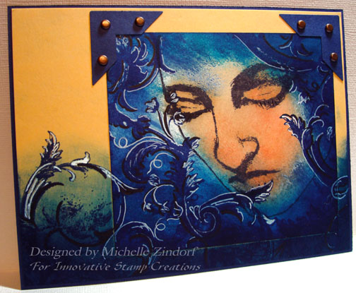
My tutorial today includes a sneak peek of two of the stamps that will be released by Innovative Stamp Creations on June 13, 2008.  The ladies face is from the stamp sheet “Thoughtfulness” and the flourish is from the stamp sheet “Artsy Victorian“.   Love them!

Here is a link to Innovative Stamp Creations online store:  http://www.innovativestampcreations.com/ischomepage.html

Let’s get started.  🙂

Supplies:

Stamps: Innovative Stamp Creations – Thoughtfulness & Artsy Victorian
Paper: Stampin’ Up Whisper White, Apricot Appeal & Night of Navy
Ink: Stampin’ Up Black, Adirondack Denim, Stream, Aqua, Mountain Rose, Peach Bellini
Accessories: Brads, Black marker, White Gel Pen, Piercing Tool, Sponges, Stamp-a-ma-jig, Photo Corner Punch

dsc04450.JPG

Using a Stamp-a-ma-jig for place, stamped the Thoughtfulness face with Black ink on Whisper White card stock.

dsc04428.JPG

dsc04429.JPG

Sponged Peach Bellini ink on the image.  Heavier on the eye lids.

dsc04430.JPG

Sponged Mountain Rose on the the image, leaving the upper left side lighter.

dsc04431.JPG

Sponged Aqua ink over the remaining white area of the card stock and a little around the edges of the image.

dsc04432.JPG

Sponged Stream ink on, leaving a light area to the left of the image.

dsc04433.JPG

Continuing to get darker yet, sponged on Denim ink really getting dark on the right and bottom.

dsc04434.JPG

Using the Stamp-a-ma-jig again for placement, stamped the flourish with Denim ink around face.  How did we ever get along without flourishes!

dsc04435.JPG

dsc04436.JPG

Put in a shadow by tracing the side of the flourish that is furthest from the face with a black marker.

dsc04437.JPG

Highlighted the side of the flourish that is facing the face with a white gel pen.  Now this helps create depth.

dsc04438.JPG

Glued main image panel to a panel of Apricot Appeal.  Stamped more flourishes using Denim ink of both the bottom panel and the main panel.

dsc04439.JPG

Sponged on Stream ink over the bottom 1/3rd of the card stock.

dsc04440.JPG

Sponged Denim ink at the bottom of the card stock.

dsc04441.JPG

Added Punched Photo Corners and a bottom layer of Night of Navy Card stock.

dsc04442.JPG

Decided to accent the flourishes last stamped with a black marker and a white gel pen the same as I had done on the main image panel.

dsc04443.JPG

Using my piercing tool I added brads to the photo corners.

dsc04444.JPG

Here you have it the completed card measuring 5″ x 6.5″. 

Hope you enjoyed this sneak peek tutorial and will accent those flourishes the next time you stamp them.  I think it makes a huge difference.  What do you think?

May your day be one of peace and serenity.

Until my next post. . . . . . .

Michelle

22 thoughts on “ISC Thoughtfulness Sneak Peek – Tutorial

  1. Tamara's avatar Tamara

    That is a beautiful card and putting it on the light colored paper really makes it pop. I want to get those stamps and try it. thank you.

    Like

  2. Carol's avatar Carol

    the depth of color on this card is stunning! Love the stamps, and love how you put this all together for one incredible work of art!! You are amazing!!

    Like

  3. Janet's avatar Janet

    I really like how you use the dark and white to bring out the flourishes. Your card is amazing! So much talent! I appreciate all the time you take to show us your step by step tutorials.

    Like

  4. Nicole Steele's avatar Nicole Steele

    I think you are right about the markers making a huge difference! I’ve seen you do this on other cards and I’ve begun trying it myself. I love the effect! I love the mood of this card you did – thoughtful, of course, but the flourishes and darker shades of blue and black make it seem like the woman is thinking very deep, conflicting thoughts. Great artwork!

    Like

  5. Girl, me thinks you must have the inkiest fingers out there! I absolutely love what you have done with the new sheets. The colors are awesome, so is the sketch!

    Like

  6. Veee's avatar Veee

    Thanks again for the fantastic tutorial and the inspiration. I didn’t think I liked face stamps but you have made a liar out of me. This one is fantastic!

    Like

  7. Lisa Foster's avatar Lisa Foster

    Wow Michelle! This is gorgeous! I really really LOVE it!
    I have to ask a question about the adirondak pads: (so sorry if you’ve already answered this a million times)
    I noticed that you use both SU and these, so my question is…do the adirondak colors vary a lot from SU, or do you like something different about them? ( Like is Denim way different than Brilliant Blue). Just curious as to why you use both…
    Thanks for sharing your wonderful talent 🙂

    Like

  8. Lisa asked “I noticed that you use both SU and these, so my question is…do the adirondak colors vary a lot from SU, or do you like something different about them? ( Like is Denim way different than Brilliant Blue). Just curious as to why you use both…”

    Lisa, the only reason I use one or the other brand is color. Denim is a very different shade of blue than Brilliant Blue. It’s nice having both SU and Adirondack to get more variation. 🙂

    Like

  9. Jamie Wilcox's avatar Jamie Wilcox

    Michelle, this is a stunner. I love the layers upon layers of color and how creatively you combine stamps. This is simply a work of art!

    Like

  10. WOW…like someone else already said. Just stunning. Also as another mentioned, I never thought I would like a “face” stamp, but I have changed my mind. Thank you so much for taking the time to share step by step process. I am learning so much from your blog.

    Like

  11. Heather Fullerton's avatar Heather Fullerton

    Wow! I love the accent on the flourishes. I would never have done that but I sure will try it now…you are such a wonderful teacher. Love the card and love the intense colors that are so you. Thanks for sharing.
    Retired Heather

    Like

  12. Pat J's avatar Pat J

    The highlights and dark shadows you apply make a world of difference in the depth of your pieces. Of course, so do the layers of ink colors. Fabulous work. I’m going to go through all your tutorials now that I’ve ‘found’ your site.

    Like

Leave a reply to Carol Cancel reply