Quiet Moment – Tutorial #159 and Blog Candy!

dsc07166.JPG

Today’s tutorial has a bit of a different color combination going on.  Sometimes I get in a rut and use the same colors over and over.  Thought I would experiment and brighten things up a bit with this card.

I’m using a stamp sheet by Innovative Stamp Creations “Minibook Series: Be Thankful”.

Here is the link to Innovative Stamp Creations Website:   http://www.innovativestampcreations.com/ischomepage.html

I also have a stamp sheet of these to give away as blog candy!!!!

dsc07169.JPG

If you want to be entered to win this great stamp sheet all you need to do is leave a comment on this post telling me your favorite sunset/sunrise color combination.  If you are getting this blog update by e-mail you will need to click on this link so you can leave a comment at the bottom of this post:   http://zindorf.blogs.splitcoaststampers.com/2009/01/04/quite-moment-tutorial-159-and-blog-candy/

I will use a random number generator to select the winner on Wednesday, January 7th.  Good luck to all!

Now on with the tutorial.

Supplies:

Stamps: Innovative Stamp Creations “Be Thankful”
Paper: Stampin’ Up Whisper White, Soft Sky & Basic Black
Ink: Stampin’ Up Summer Sun, More Mustard, So Saffron, Distress inks Brushed Corduroy, Black Soot, Walnut Stain, Mustard Seed & Weathered Wood
Accessories: Brayer, 1 1/4″ Circle Punch, White Gel Pen, Green & Brown Faber Castell Markers, Post it Notes, Sponges

dsc07170.JPG

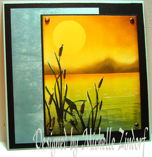
Brayered So Saffron ink at the top of a 3.75″ x 4.5″ piece of  Whisper White Card stock.

dsc07144.JPG

I wanted it to be brighter and warmer in color so I brayered over the So Saffron Ink with Summer Sun Ink.   Yep, that’s better.  🙂

dsc07145.JPG

Punched a 1 1/4″ circle out of the sticky part of a post it note and put it on the card stock as a mask for the sun.  If I would have masked the sun before any color was put on the White card stock, of course the sun would be white.  I did it this way so the sun would not be so stark in color.

dsc07146.JPG

Brayered More Mustard ink at the top of the card stock only going down far enough from the top to go over the Sun mask.

dsc07147.JPG

Removed the sun mask.

dsc07148.JPG

Streaked Weathered Wood Distress Ink at the bottom of the card stock using the direct to paper technique.   These Tim Holtz Distress ink pads are so very perfect for direct to paper techniques because the ink pad is raised up from the base of the pad.

I streaked the ink in order to try create some ripples in the water. 

dsc07149.JPG

Brayered Eathered Wood Distress ink at the bottom of the card stock to blend the streaking in a bit.

dsc07150.JPG

Used the same direct to paper streaking technique with a Mustard Seed Distress ink pad in the middle of the card stock and going in to the Weathered Wood inked area a bit.  That really warmed the water up some. 

Be careful not to cover all of your Weathered Wood ink with the Mustard Seed ink.  Remember Blue and Yellow make Green.

dsc07151.JPG

Masked the sky area of the main image panel with a Post it note and Sponged More Mustard ink at the post it note edge to create a little beach area.

dsc07152.JPG

Took the post it note mask off and flipped it around.  Now I am masking the water and the beach area with the post it note.  Sponged Brushed Corduroy ink on to create some mountains in the distance.

dsc07153.JPG

Added some Darker Walnut Stain ink to the bottoms of the mountains.

dsc07154.JPG

Stamped the Cattails with Black Soot ink.

dsc07155.JPG

dsc07156.JPG

Sponged More Mustard ink heavily at the top Right corner of the main image panel to create a little interest in the sky.

dsc07157.JPG

Outlined the right sides of the Cattails with a Brown Maker.

dsc07159.JPG

Outlined the right sides of the Cattail Leaves with a Green Marker.

dsc07160.JPG

Added a few highlights to the Cattails and a few dashes in the water area using a White Gel Pen.

dsc07161.JPG

Used the direct to paper technique again on the bottom left corner of the main image panel and on the right side of a Soft Sky Background panel.

dsc07163.JPG

Assembled card and here it is finished measuring 5 5/8″ square.

dsc07166.JPG

I hope this tutorial has inspired you to experiment with color combinations today.  I think you will be pleasantly surprised!

May your day today be filled with peaceful scenes.

Until my next post. .. . . . . . . . .

Hugs,

Michelle

Links to all my tutorials can be found here:  http://zindorf.blogs.splitcoaststampers.com/tutorials-ive-written/

Here is a link to my workshop calendar if you want to get info on beginner and advanced Brayer workshops:  http://zindorf.blogs.splitcoaststampers.com/workshop-calendar

Frequently asked questions answers:  http://zindorf.blogs.splitcoaststampers.com/frequently-asked-questions/

409 thoughts on “Quiet Moment – Tutorial #159 and Blog Candy!

  1. Your cards are never in a rut for me – I love looking at them ALL!! WOW! Thank you for the chance to win some excellent blog c a n d y!! YUM, YUM! And Happy New Year, Michelle Z!

    Best,
    Elaine

    Like

  2. Gail's avatar Gail

    Every peice of art you produce is amazing..i love it all..
    My favorite sunrises are the dawning of reds/yellows in with the blues.
    Sunsets are the dark blues with the pinks and purples..thanks..loves ya

    Like

  3. Gidget-Trish's avatar Gidget-Trish

    Love this card. I really like the way the cattails stamp shows the reflection in the water. And I love the way you did the water in this picture. Awesome. I just made a photoscape card with a beautiful sunset picture that I took at the lake. It had many shades of pink, some blue and lavendar. Gorgeous!They are my favourite sunset colours. Thanks for the chance to win some blog candy.
    Trish

    Like

  4. StampT's avatar StampT

    Sweet…of you to offer this pretty set. I’m definitely not a sunrise person — so my colors are for sunset. I LOVE SUNSETS!!

    A couple of weeks ago I commented to my husband about a sunset. It had pale yellow, a funky melon-y orange, and a funky purple/plum. It was gorgeous! I’m always amazed at the colors God picks to paint the sky with. I try to take inspiration (and pictures) when I can.

    Like

  5. Breathtakingly beautiful. I am, as always, im awe of your talent.
    My favourite colours for a sunset would be fiery red and orange.
    Thanks for this excellent tutorial!
    Minna

    Like

  6. Patti's avatar Patti

    Another beautiful card. You are amazing that you can make these beautiful cards every day and still do a full day’s work, then come home and do all the cooking, cleaning and home chores. And now starting an exercise regime too!!! You go girl!

    Like

  7. chrisd's avatar chrisd

    I love all of your sharing times with all of us.
    My favorite sunrise would range from goldenrod to salmony pink here in Michigan but my favorite one was on a special trip to Maui with my husband 5 years ago. It took my breath away!

    Like

  8. Sara's avatar Sara

    I am new to your blog and I am so impressed with your talent and your willingness to share your ideas. The way you have recreated a sunset is awesome!

    Like

  9. I love your work…I have my brayer, inkpads and the white pen you recommended sitting on my stamp table…but have yet to dive in and try your tutorials. I will admire from afar…just being a chicken. Why mess with perfection? However, my New Year’s resolution is to be brave and try new things. I may just have to try it as I love what you did with this card…they are my favorite colors
    Thank you for your inspiration.
    Marianne

    Like

  10. Marilyn Kay's avatar Marilyn Kay

    Hi Michelle,

    I love the warn cozy glow of the oranges and yellow in contrast to the cooler but soft greens of the water. I love all of your work and just wish I could combine colors like you.

    Marilyn Kay

    Like

  11. Alison's avatar Alison

    Great card. Love the cattails. Not sure if I have a favorite sunrise/sunset color combo. I love them all and they always take ones breath away.

    Like

  12. Theresa Wright's avatar Theresa Wright

    Hi Michelle! I love the sky-blue pinks and golds we see here in California over the ocean. You should be here when both the moon and the sun are in the sky, with purple mountains on one side and the ocean sunset on the other, a few twinkles in between. Incredible.
    Thanks for blogging,
    Theresa

    Like

  13. Sylvie Greeniaus's avatar Sylvie Greeniaus

    Hi Michelle,

    your color comboes are always amazing. I also like blues, pinks and purples in sunsets.
    Thanks for posting your work. The posts aren’t as frequent? What happened?

    SG

    Like

  14. Verda's avatar Verda

    You are absolutely amazing with what you can accomplish with a roller. I keep trying but mine never seem to turn out looking anything like yours. LOL

    My favorite colors for sunrise/sunset are pinks and purples with a tiny bit of yellow sometimes.

    Thanks for this opportunity.

    Like

  15. Nancy C's avatar Nancy C

    Your art is always so inspiring and this card is no exception. I love how the cattail stamp has the rippled reflection in the water. You tutorials have helped me improve my own cards.

    I love all sunsets but I tend to use pinks, corals and purples in mine.

    Nancy

    Like

  16. My favorite sunset colors are ALL of them! The sunset is one of my very favorite things to watch. I love it, no matter what the color.

    Your card is terrific! It looks like a photo! Amazing!

    Like

  17. First off Happy New Years to you I had been wanting to come and say Hello to you and was so happy to see new creations! I squealed and my DH said what happened and I said Michelle is back posting her amazing creations! lol.. (((HUGS)) to you and another beautiful card indeed!

    Like

  18. Moodymom's avatar Moodymom

    WOW!! Love this card, color combinations…but then I always do. I am so inspired with your creations. I love the different shades of yellow for sunset/rise with a bit of red orange and lavender and pink. Depends on what I am using it with…desert, mountains, water…I think i need to go try it now!! 🙂

    Like

  19. Farah's avatar Farah

    Just wanted to say I love your work. I would have to say my favorite sunset is pinks and a hint of purple. Looking at your cards leave me breathless. You are my inspiration. Thank you for giving me a chance to win the stamp set. I hope 2009 is a great year for you.

    Like

  20. Linda's avatar Linda

    This is lovely, I like the feel of it. I live in the desert and the sunsets and sunrises can be very beautiful with streakes of pinks, orange, yellow and blues.

    Like

  21. Here in Florida there are really beautiful sunsets. I would love to duplicate some. There are 2 that are my favorites. One has a pink/peach/ dk. blue combo and the other is vibrant red/ orange and yellow. I am determined to try your directions for making sunsets. Pat

    Like

  22. Jayne's avatar Jayne

    Michelle, I remember reading a note from a child once that read, “Dear God, I didn’t think that orange and purple went together until I saw it last night in your sunset.” Since then, they have become my favorite sunset colors. Thanks for your creativity.

    Like

  23. Karen Sullivan's avatar Karen Sullivan

    My all time favorite is what I call “sky blue pink.” Looking over the horizon on the water, what beautiful colors! It’s not often we get those but when we do, it is simply gorgeous. Thank you for this tutorial. I will ahve to try the colors soon.

    Like

  24. The prettiest sunset I have ever seen was in Lake Havasu City, AZ. It was not only yellow and orange but also had pinks and purples. If you want a copy of the photo, I can e-mail it to you. It could give you inspiration. Yea, like you need any. You always inspire me.

    Like

  25. LaNell's avatar LaNell

    Happy New Year! Love this color combination. Would love to get some blog candy.
    Thanks for scheduling in your tutorials. I’m the same when it comes to exercise. Has to be done in the morning or it does not happen.

    Like

  26. Janet's avatar Janet

    Michelle, this is so peaceful! I love it. I like all the shades of blue, your colors today and when the sky turns pink with yellow running through it and blue at the top.

    Like

  27. WOW, a beautiful card you’ve made. AGAIN!!!!
    I’m so jealous of you. You make it seem so easy…….

    Well my favorite colours are all sorts of yellow and reds for sunsets.
    I saw one in Thailand that was completey overwelming!

    Many greetings from the Netherlands,
    Jolanda

    Like

  28. I just can’t believe how you keep coming up with such gorgeous cards – this one looks almost like a photo!
    I love the combo you’ve used here for sunsets – maybe with a slight sponging of a deeper orange/red at the top edge.

    Like

  29. AnneSATX's avatar AnneSATX

    It looks like I’m not the only one, but my favorite combination for sunsets is: More Mustard, So Saffron and Summer Sun. I’m so glad you’re back — it’s been empty without your tutorials. Thanks for the chance to win.

    Like

  30. Cindy's avatar Cindy

    What a beautiful card and I would love to win that stamp set! My favorite sunrise/sunsets are those that can be seen in the desert with varying shades and intensities of yellows, oranges and reds. Thanks for a chance to play.

    Like

  31. What a gorgeous card! My favorite sunset colors are hot pink streaked with orange and lavender. Living in the Lakes Country of beautiful Minnesota, we get a lot of those sunsets here! They are wonderful. Thank you Michelle, for sharing so much with all of us!

    Like

  32. Jayne's avatar Jayne

    Hi, Michelle,
    You do such amazing work! I love your style. I think my favorite color combination is the next one that I see. I’m not sure that I’ve seen a sunset/sunrise combination that I haven’t loved. For instance, I just saw a new one the other day and it was gorgeous. So I came home and used the colors that I saw. They were: Night of Navy, Denim, Baja Breeze, So Saffron, Apricot Appeal, Orange. When you get colors like that in close proximity with objects silhouetted against the light, it’s really beautiful, just like your cattails. Thanks for all your great tutorials.

    Like

  33. Jean Rowell's avatar Jean Rowell

    I definitely thinks the pinks/purple sunsets are my favorite color combinations of all times. It’s really hard to say, I just love them all and their uniqueness each day !! Happy New Year Michelle

    Like

  34. Emanuella's avatar Emanuella

    If simply love your work and inspired daily by what you do. I can’t imagine how long it must take to photograph each step etc.
    I have been forever spoiled by all sunsets after living in Az. The whole sky is illuminated by the deepest pinks and rusts and orange you have ever seen. It is breathtaking… the memory stays with you always

    Like

  35. Sharon in NE's avatar Sharon in NE

    I love the sunsets I can see outside our living room window. We have a beautiful sky full of blue, purple, pink and peach. I always stop and mentally “high five” God for his incredible artistry.

    Like

Leave a reply to chrisd Cancel reply